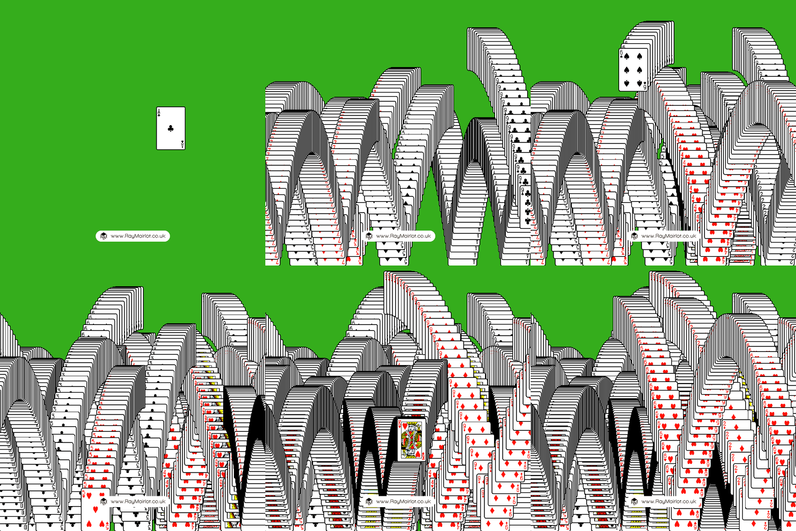
I just remade the 'Solitaire Win Screen' in Blender with Geometry Nodes:
Playing card images © Chris Aguilar at https://totalnonsense.com/open-source-vector-playing-cards/, LGPL 3.0
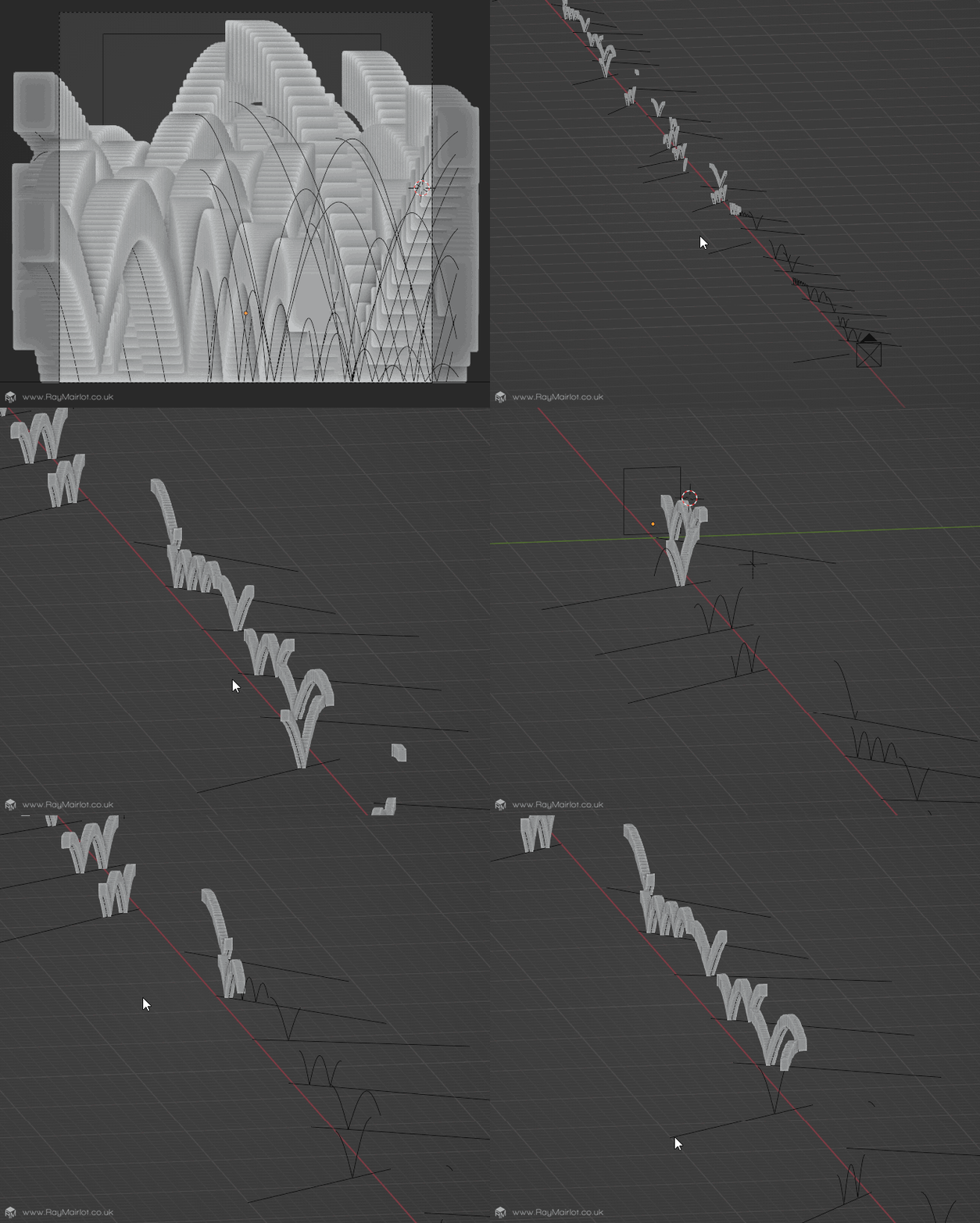
This is what it looks like in the viewport; cards are instanced on curves which are instanced along lines, which are instanced along the x axis, so that the cards can appear in front of each other when looking through the camera.
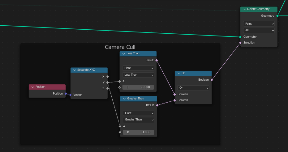
Cards are culled when they are outside of the camera view, which is easy when the camera is orthographic.
As well as performance, this is mainly done so that the next card 'cascade' starts as soon as the previous one is off-screen. All cards are instanced at once and appear based on their index using another delete geometry node.
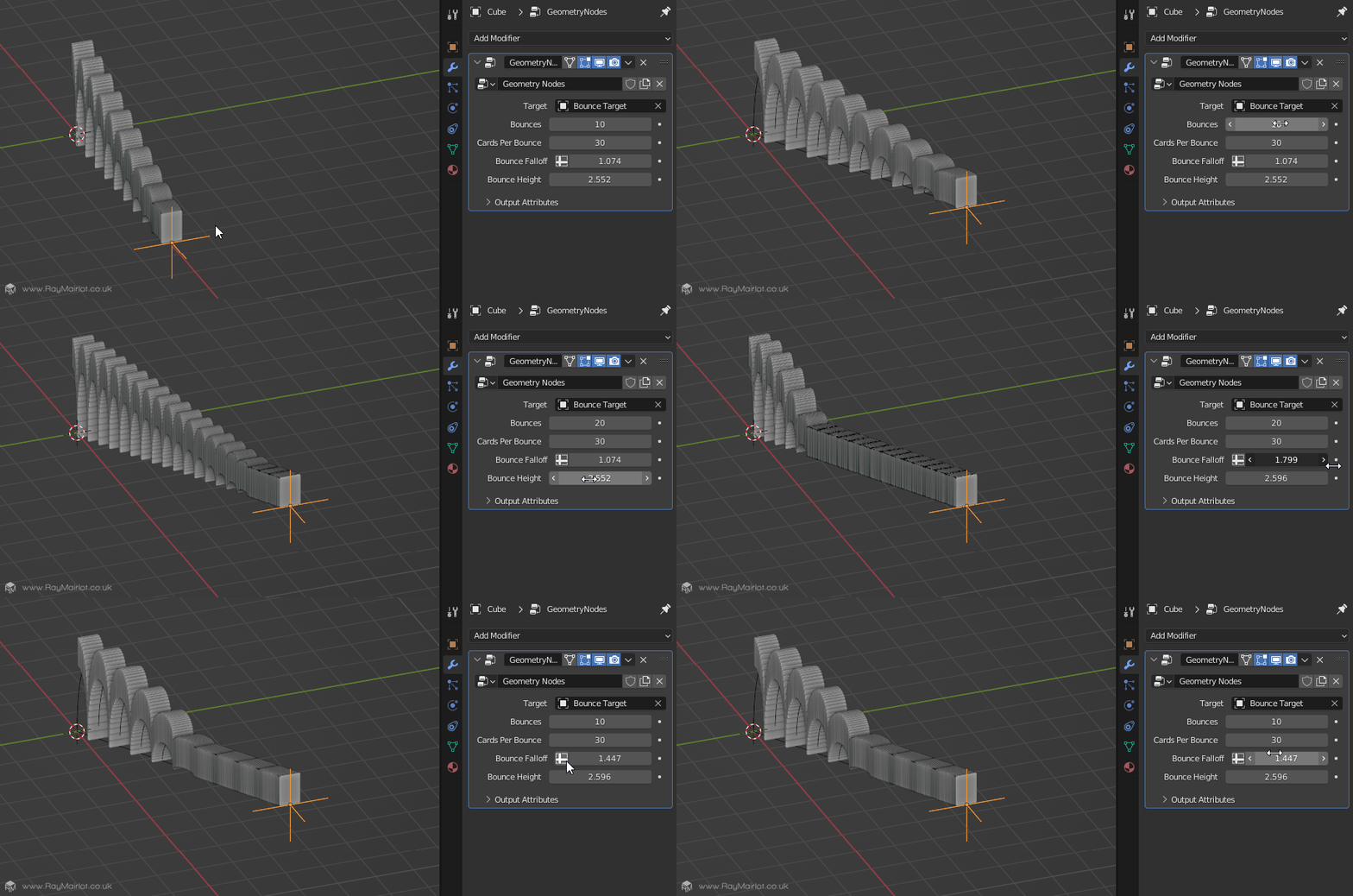
Originally I built a single 'cascade' with some nice controls, but then realised I couldn't instance this node group and have random values for each parameter 😐. Instead, I rebuilt it so all lines and meshes are created first and then all the cards instanced at once at the end.
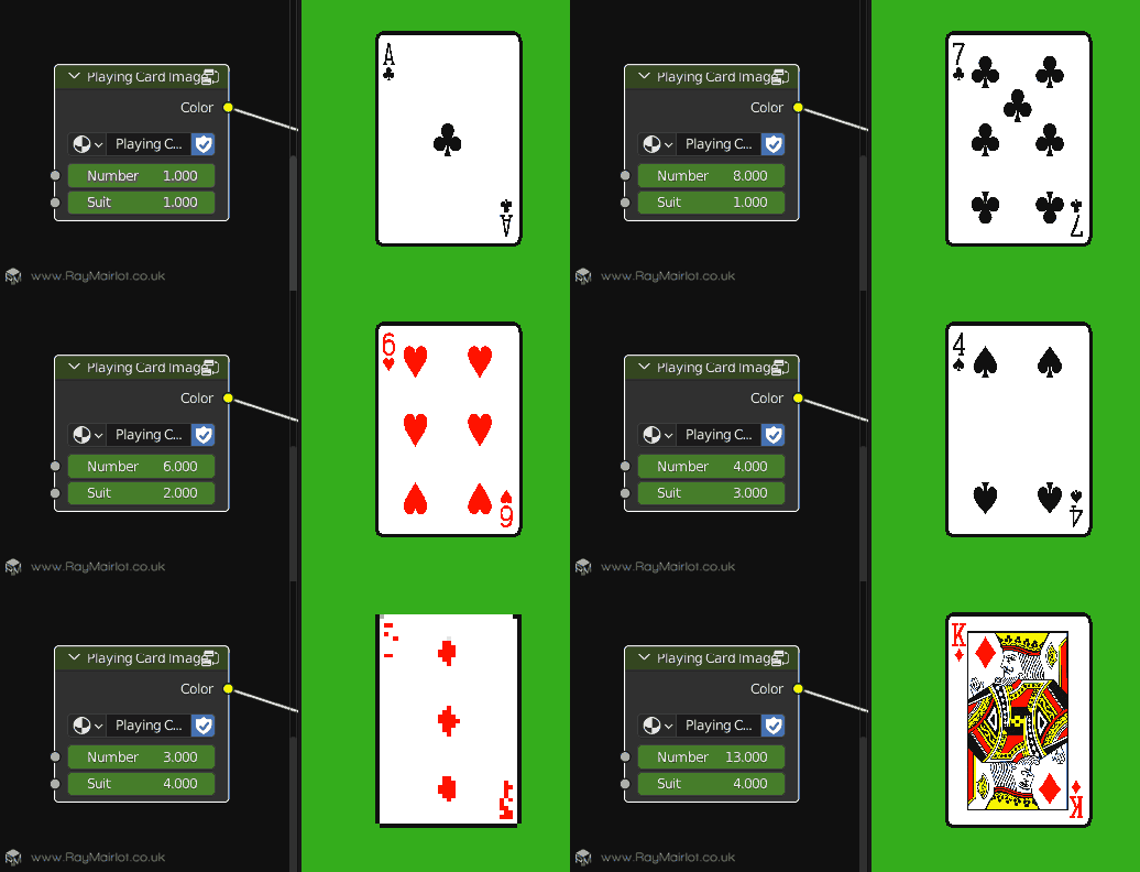
All the cards share the same material and a node group selects the number and suit. The card images are all in one texture in 4 rows and by multiplying the UVs I can change which card image is displayed.
(In reality, I don't keyframe the node's values, I use the x position of each cascade to select a number between 1 and 52 that gets fed into this.)
At first I was using freestyle for the black card outlines, which was great to get consistent line thicknesses, but with a lot of cards in front of each other it took too long to generate the view map so I just extruded the edges of the card and coloured them black 🤷♂️.
Finally, turn down the samples to 1, set light path bounces to 0, set the pixel filter to 0.01 (anti aliasing) and despite having 2,500 instances you get 0.1 second renders and something that looks like it's from 1995 😎.
Oh, and the 20 second GIF at the top is 732kb thanks to its simple colours!
Ray.
